Pantone has a new color for the year and it’s a beautiful purple hue.
Why in the world is it important, and what does it have to do with your business plan?
This practice of introducing a new color every year is NOT just to give people something new to talk about. It’s actually based on multiple current trends worldwide, and is the perfect example of symbolism at it’s finest. This particular color of 2022 is a completely custom formula of red and blue, each of which ties in it’s own symbolic values—and each that creates an even stronger expression when combined.
That said, marketing professionals are still too often hesitant to incorporate new palettes to their business strategy. It’s understandable, for all the reasons that “Brand Guidelines” are so vital in instant recognition.
There is a way to do it, and do it tastefully, without compromising brand integrity.
Here are a few examples:
NFL
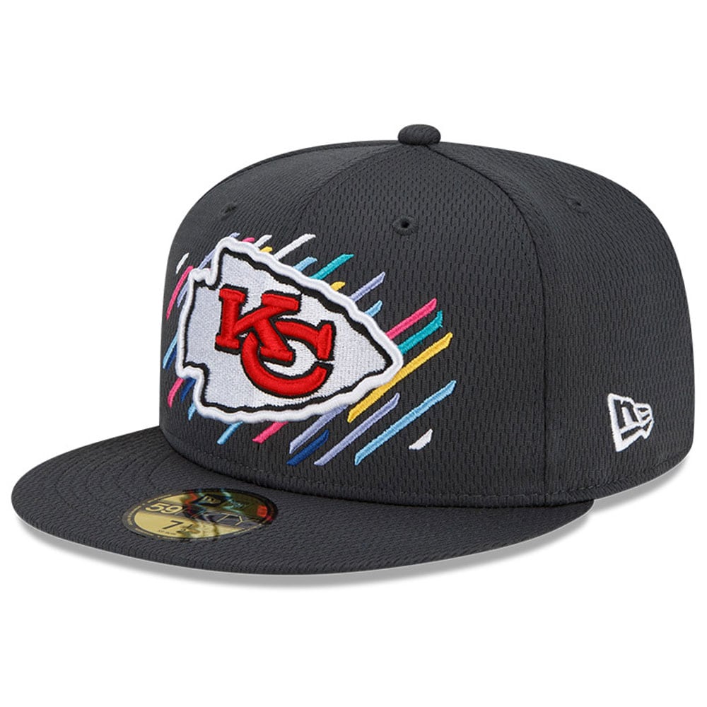
In 2009, the National Football League introduced their Crucial Catch initiative encouraging early screening to “intercept” breast cancer. They dropped pink all over the playing field in the way of uniforms and accessories, and caused a commotion that re-enforced the fact that real men DO wear pink. Licensed shops were full of pink merchandise, allowing fans to quickly and easily support the cause. Portions of the proceeds always go back to the cause, so it’s a win-win all the way around. 
It was such a successful campaign that they decided to extend it to other types of cancers as well, incorporating ALL of the awareness colors into the graphics.
Seeing the importance of the program, the NCAA jumped in as part of a chain reaction for all sporting teams to support and give back to causes that were important to them. In 2018, the Miami University RedHawks allowed each individual player to pick a cause that personally affected them and wear that ribbon on their helmet. The result was a personal story behind each player and the ribbon color that they chose.
Unless you’ve been off the grid for the past 10 years, you’ve probably noticed that Google frequently showcases various versions of it’s logo on their search page. They’re called Google Doodles, and most of them are super fun and engaging. Sweet visual appeal aside, there is a specific intention for each and every doodle – highlighting people and events that have impacted the world and deserve recognition.
Not only does Google change the brand colors for these doodles, they often convert the logos to creative graphics and incorporate animations. Each doodle is unique, and each one is uniquely impactful.
This is one of our personal faves that celebrates the birth of hip-hop music with an interactive DJ turntable. Check it out on your next snack break…you won’t be sorry.
They also use their brand colors for messaging outside of their logo, like how they support specific causes like Black History Month.
Random side note: Google was originally launched as “Backrub” in 1995. That lasted approximately 750 days (aka way too long) before they rebranded to the current name. Here’s the whole story from the horse’s mout…uh, from the landing page found via Google search.
Bud Light
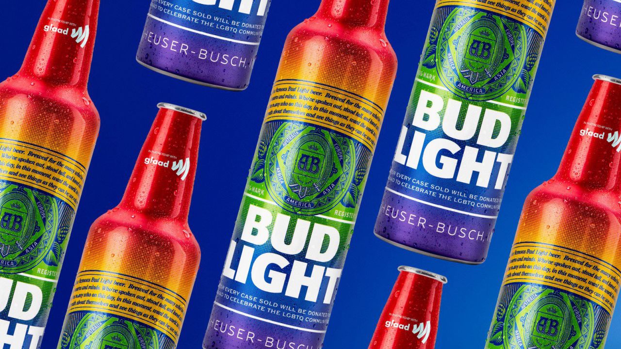
In 2019, one of the most iconic American brands utilized it’s brand platform to encourage equality in another creative way. The designed a limited edition commemorative PRIDE aluminum bottle with proceeds of sales benefitting the LGBTQ+ community through GLAAD. It was a quick and simple way to utilize colors to create an instant connection with a cause that they feel strongly about supporting, and have for 20+ years.
Indeed, each color can evoke a specific emotion. There’s no reason to NOT capitalize on the varying emotions and tie them to your brand and it’s mission. After all, it’s free, it’s engaging, and it’s impactful. Check out this list of awareness colors and this cheat sheet on colors and their meanings, and then let’s chat about how to get colorfully creative with your brand and it’s mission(s).


