When you hear the name John Deere, what color comes to mind?
How about UPS?
Target?
If you said green, brown, and red, then you already know how important colors can be for brand identity.
Whether starting a business from scratch or refreshing a brand, color is an important thing to consider when finalizing a corporate design.
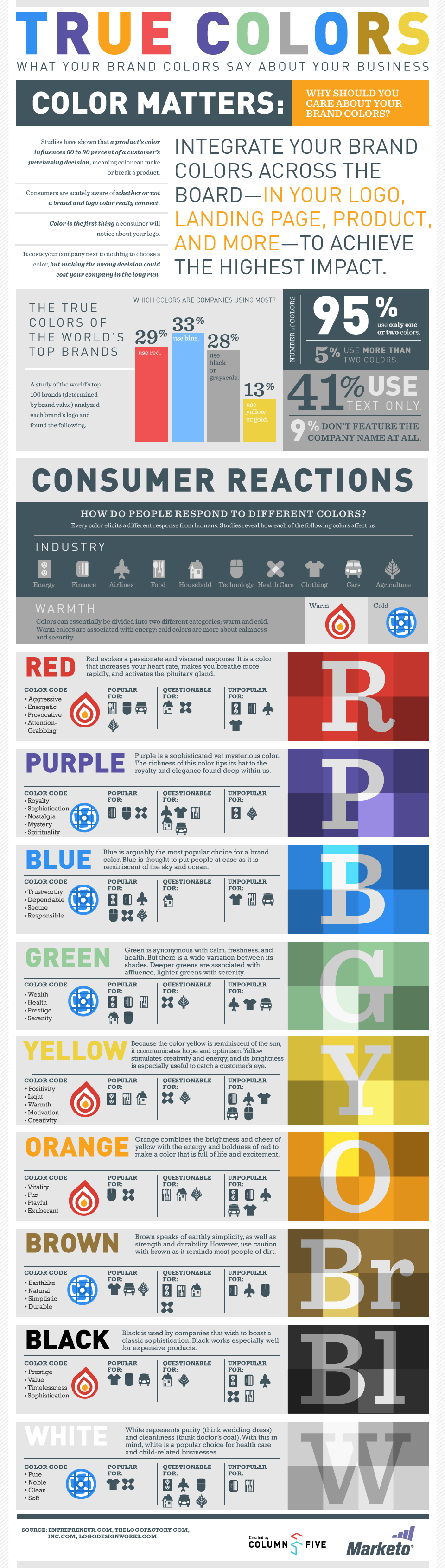
Colors trigger emotions – good, bad, or indifferent – and emotions are a very significant factor in the consumer’s decision-making process. So how many colors…or emotions…should be incorporated?
A study by Marketo shows that 95% of the world’s top brands use one or two colors in their branding, so most of them keep it fairly basic. However, as simple as it may seem, there is more to it than just picking out a few swatch cards. We suggest narrowing the selection to 2 or 3 colors: choose a strong base color as the focal point, one complimentary accent color and one neutral color, if desired.
Whether a new startup or a thriving enterprise, your brand colors matter. Likewise, once those colors are finalized, developing specific brand guidelines will help maintain the strength of your desired corporate identity, and deliver a constant and consistent emotion tied to your brand.
Example: The Colors Behind Our Brand
Looking back at the history of our company, when we were founded in 1988, our corporate brand included various shades of blue. Not a bad selection, considering blue represents dependability and trustworthiness. It’s been said that blue is one of the most popular colors from a branding perspective.
In the early 2000’s, we refreshed our brand and wanted something that would visually depict our corporate goals of being a fun and innovative supplier of unique corporate merchandise. The infographic included here from Marketo shows that orange is a color that “is full of life and excitement.” That description really embodied what we wanted our company to represent, so we incorporated that color into our most recent branding. We certainly hope it’s the feeling that others get when they see our corporate colors in action.
![]()
Following the 2 color palette mentioned previously, we chose orange as our base and a dark shade of grey for the accent color. Keep in mind that some color combos already have a strong emotion tied to them that you may choose to avoid. For example, we typically don’t use orange with a black accent because it is a color combo very much associated with Halloween – and while we appreciate the holiday, it’s just not a good fit for our desired brand image (no offense to the zombie lovers out there).
So our brand colors represent us as bold, fun, and energetic – like a cup of strong coffee with latte art. What color best depicts YOUR brand?